Updated 20/10/20
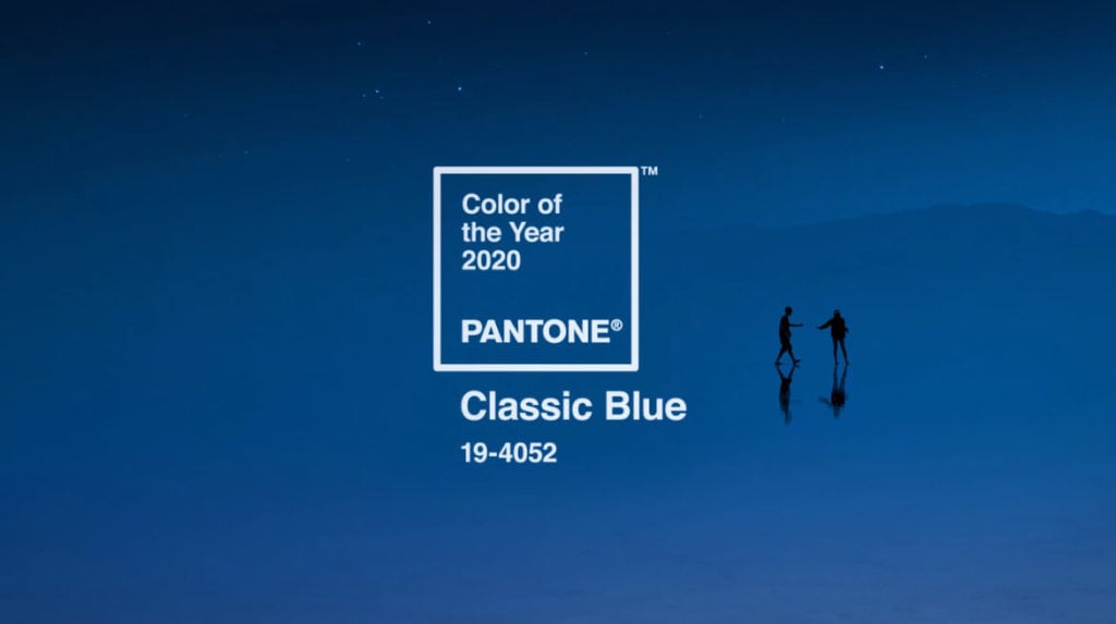
Fortunately, Pantone Colour of the Year 2020 is a lot easier to put to use than last year’s Living Coral. Rather than clashing horribly with fairly marvellous orange it complements it quite well. But using it on our own site would be selfish and cheating!

In fact, we were only halfway through January when we launched a rebrand for Brook Investment Partners. The stable, dependable blue offsetting their more modern orange font and upgraded windmill nicely.
Flashback
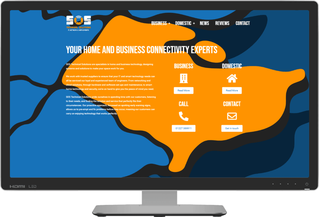
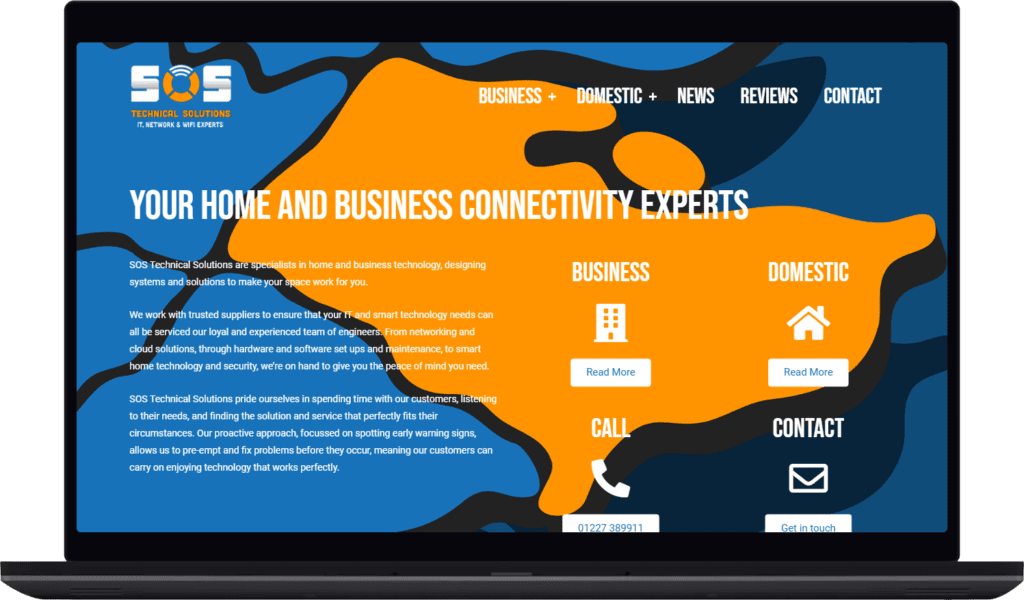
There are so many things we couldn’t predict about 2020, so it was reassuring to find that at least good colours stand the test of time! When SOS Technical Solutions came along with an existing logo and colour scheme, we needed an extra shade of blue to complete the palette. Classic Blue filled the gap and feels like a pair of bookends for a rather turbulent time in fairly marvellous history.